“For a long time, the safest choice was to keep things quiet and neutral. Now people are ready for more. Pinterest Palette is an invitation to be a little louder with how you feel—to play, to experiment and to let your world reflect the life you actually want to live”
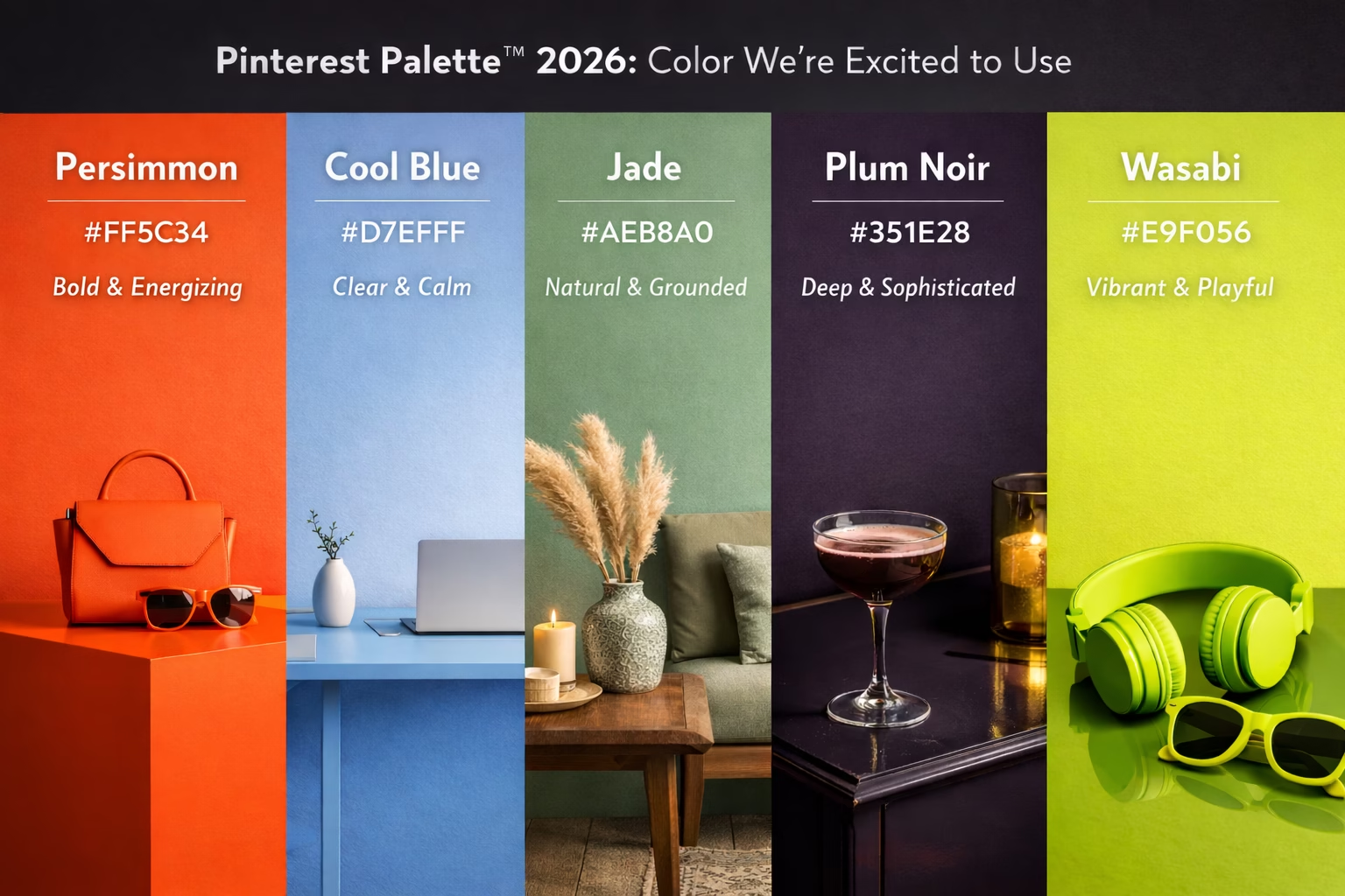
Pinterest Palette™ returns with a five-color lineup inspired by what people are searching, saving and shaping across culture. These aren’t background shades—they’re emotional signals influencing creativity, style and demand in the year ahead.
Introducing Cool Blue, Jade, Plum Noir, Wasabi and Persimmon—full-volume hues that are bold, expressive and unapologetically present. From the unfiltered joy of Persimmon and the defiant energy of Wasabi to the quiet intensity of Plum Noir, each color carries a distinct emotional charge. Even the softer tones have presence, with Jade offering grounded calm and Cool Blue delivering clarity and focus.
In 2026, color moves beyond aesthetics into emotional utility. Amid constant noise and ambient chaos, people are choosing colors that ground them, lift their mood and sharpen their attention. These hues offer optimism, escape and intention—tools for expressing how people want to feel and how they want to show up.
source : Pinterest Newsroom

What excites us most is how adaptable it feels. This is color that works across branding, digital experiences, interiors and campaigns—allowing brands to be expressive without feeling chaotic, and confident without losing sophistication. For us, it’s less about following a trend and more about responding to how people want to feel in 2026: optimistic, grounded and intentional.
This is color as a creative tool and it’s one we’re eager to use it in our work.